


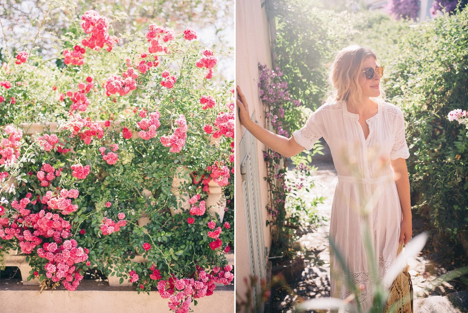
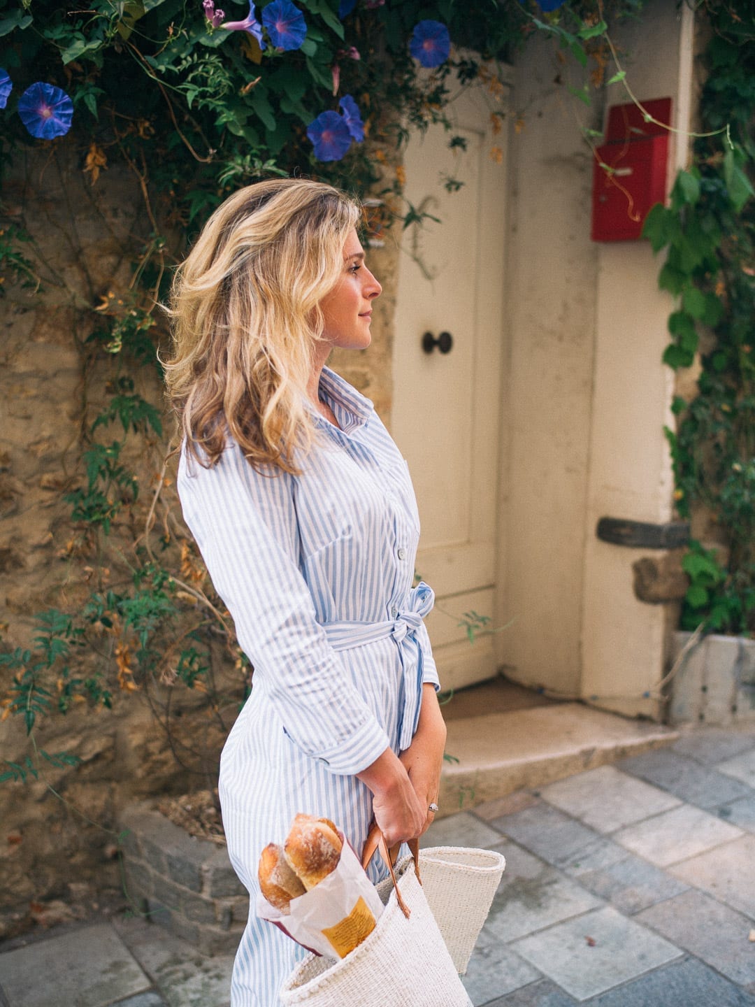
I love color. The first time that I developed and printed my own color film in the wet lab was a remarkable experience; it changed my life. It might be the primary reason I fell so in love with photography. One thing that I tell people when they ask about developing a consistent brand is to stick a color palate. It’s one of the easiest ways to set a mood, develop a feed (on Instagram) which is easy to digest and to set the tone for how you’d like to be perceived: bright, happy, moody, pensive, minimal, etc. Even though that’s my first advice, I find it the hardest to stick to. I love all types of tones and colors and I find it impossible to stay within the boundaries of one palate. This can make it a bit more challenging to tie our images together, and so I try to stick to a general set of rules keep the photographs feeling similar.
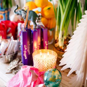
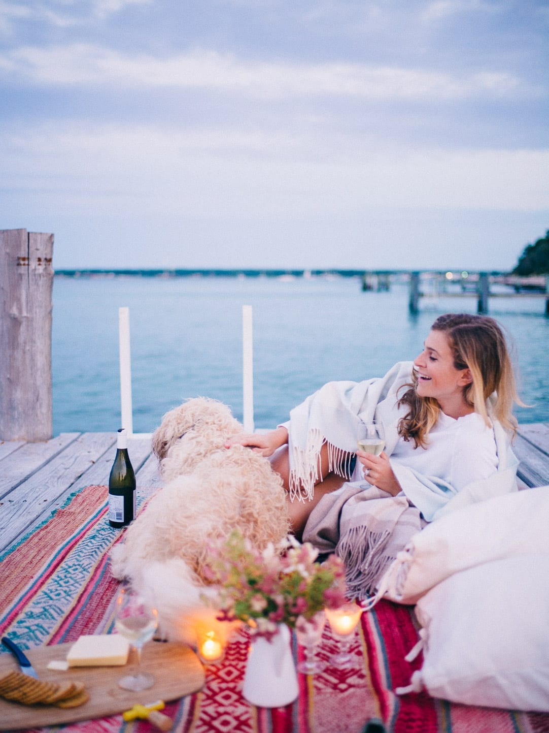
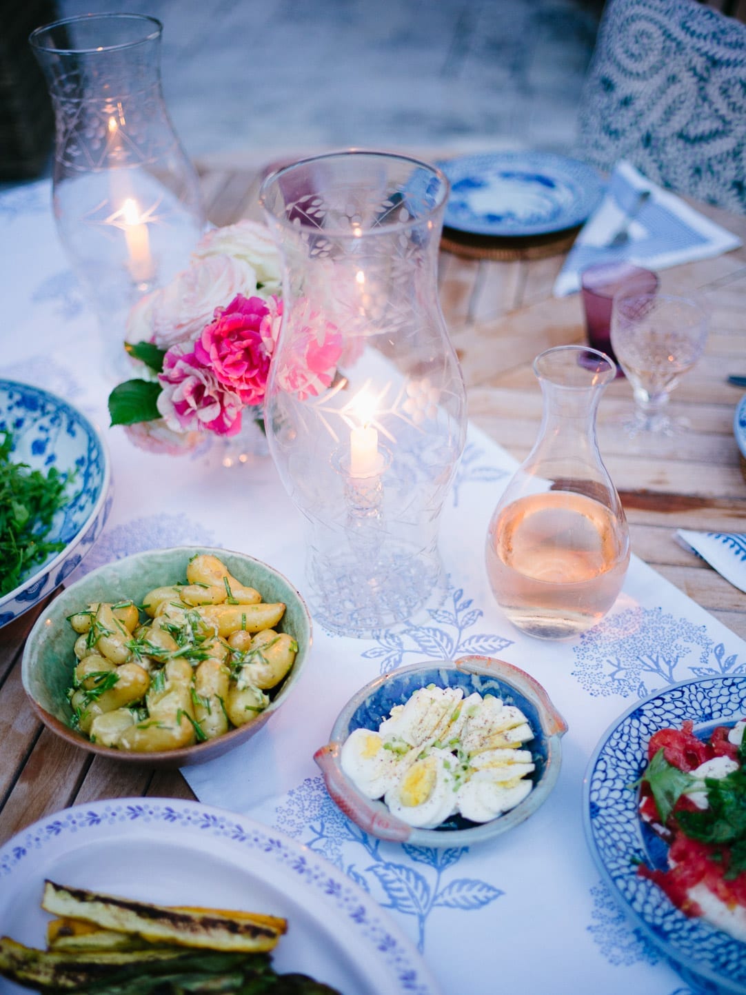
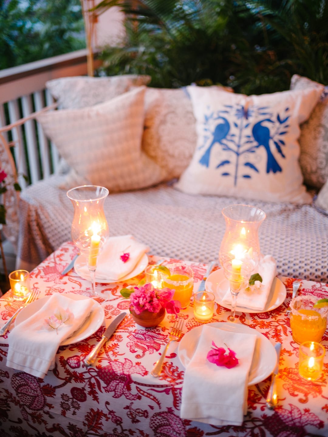
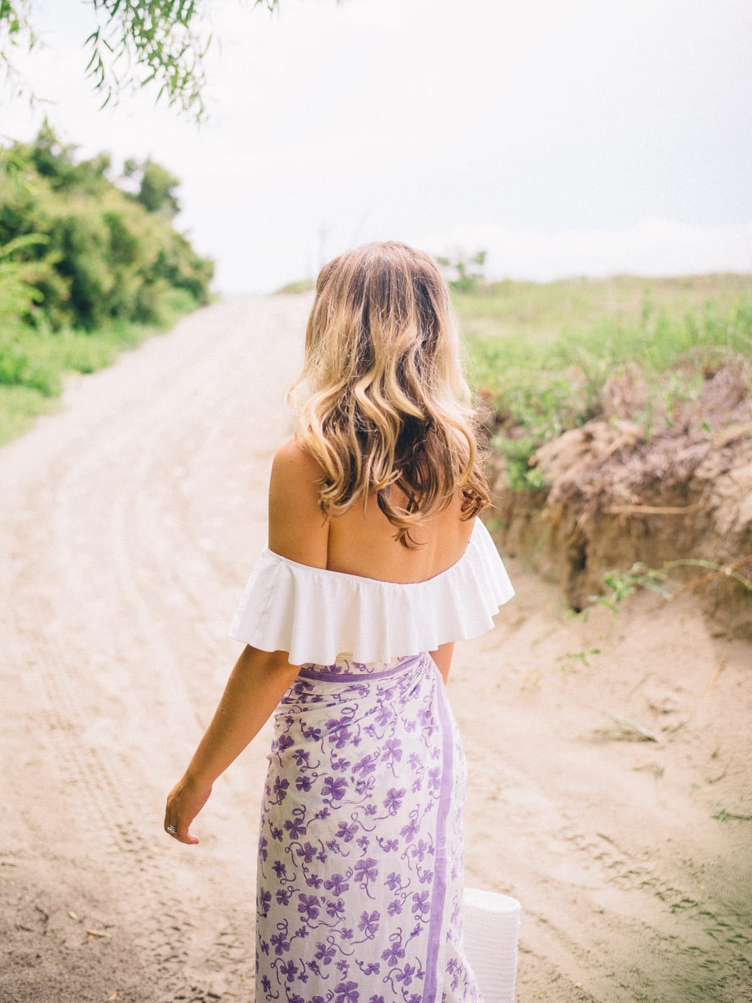
First, I try to stick to shooting at certain times of day. The morning before 11 and then the late afternoon/early evening. I also shoot quite often at dusk; I love the purple light of the last bit of day. I also like throwing candles into my images as they add a pretty glow and atmosphere. If you’re shooting late, sometimes the images can look a bit dull but if you pop up the vibrance in Lightroom, it will more accurately reflect what it looked like in real life.
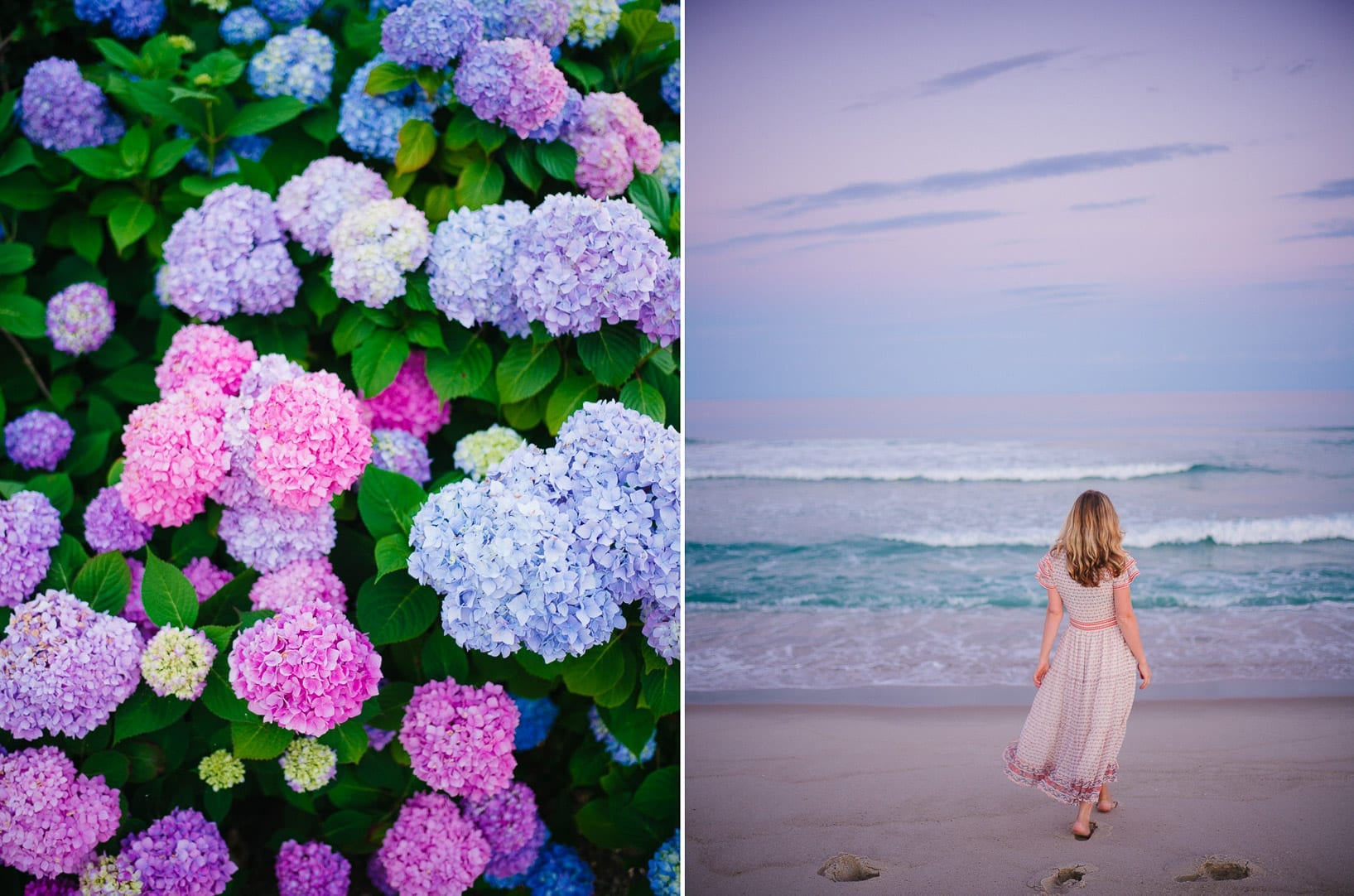
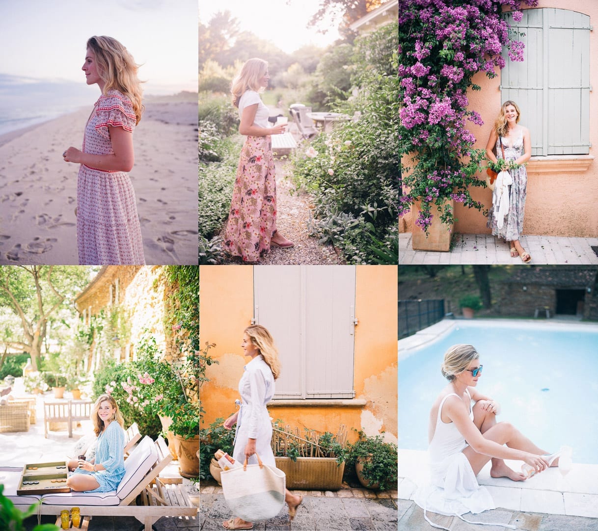
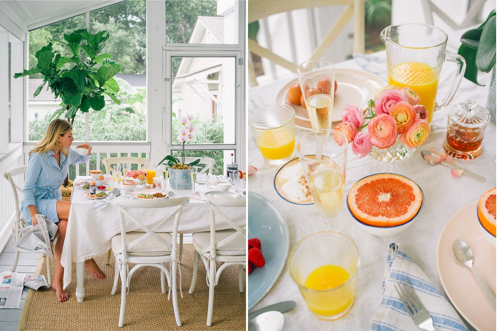
I always try to use the same filters. I use the VSCO color packs in Lightroom and on my iPhone and add warmth, pink, vibrance, more black and less shadows to nearly all my photographs. That way, when I am placing them all together, they have a tonal consistency which allows them to sit well next to one another. And that’s another thing: I always plan my image layout. I try to mix up the types of images which sit side by side. For example, I often find that a photograph with a person in it sits well next to a scenery shot, and that two horizons side by side look awful because the line travels across both images and confuses the viewer. You need a mix of push and pull, and while it might be best to keep the hues the same from photograph to photograph, it’s ok to mix it up as long as the photographs are complimentary and the colors look nice together.
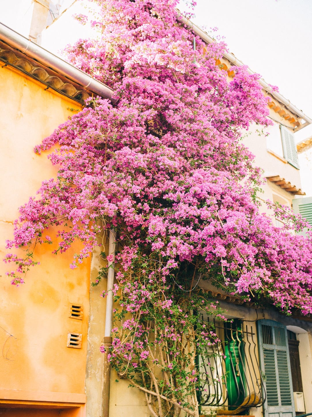
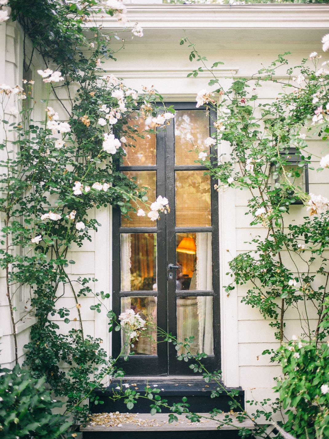
If you are shooting in cloudy conditions, I always try to have something overhead which is providing shade. If you shoot in grey light out in the open, I often find that eyes have no light in them, and that there are heavy circles under the eyes. Make cloudy conditions work for you by shooting underneath the shade of a tree, or a porch, and colors will really pop and allow you to maintain a cheerful feel, even in a gloomy setting.
Hope this helps! I will answer questions in the comments below 🙂 xx